Part 2: Filing
Introduction to the interface in Outlook
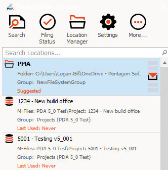
- Show the user interface. Explain that it is docked on the right-hand side but can be docked in other places. (Remind yourself of the Outlook interface - docking)

- Select different emails to show how the tiles reorganise and the suggested locations have up to 6 blue bars indicating the level of confidence (Remind yourself by reviewing the Quick Start Filing)
Filing Received Messages
- Explain that to file a message you can either double-click a tile or single-click the envelope on the tile
- File a message

 NOTE: It is a good idea to point out a word or phrase in the message you are filing so that you can use this as a search term later when showing the search capabilities
- File another message. Ideally one that will file to a different location so that candidates can see the effect
- Explain that the software learns each person's filing behaviours and that they will initially need to filter the list to find the location they need
- Type into the filter field to show how it works
- Show how you can right-click a tile to see further options
 TIP: Preparation. It is a good idea to check that the settings will result in the behaviours you hope to show. So if you know the audience want to file into M-Files and see the blue 'M-Files' category bar against filed messages, be sure to change your setting so that messages are NOT moved to deleted items upon filing.
Filing Sent Messages
- Reply to a message. Type some text then hit send. Show how the software is recommending one or more locations. (Remind yourself by reviewing the Quick Start Filing)
- Remind candidates that they can filter the list
- Explain that they can 'Send only'
- Explain that they can cancel, perhaps to add an attachment
Filing Multiple Messages
- You arguably don't need to show this, but you should as a minimum explain that users can select multiple messages and file them all at once.
