Usage Summary (All Users)
The purpose of this dashboard is to provide administrators with a quick and clear overview of PMA adoption and user activity levels across the organisation.
On the left-hand side of the screen, a summary table displays the most recent user activity, including:
- User e-mail addresses
- Last active date and time (i.e. the last time the user filed an e-mail)
- Total number of filed messages per user
- Most frequently used filing location

Users with no recorded PMA activity will have their row highlighted in red to help administrators quickly identify users who may require onboarding support or follow-up.

In addition, a traffic light indicator system is used to show how recently users have interacted with PMA (through e-mail filing activity):
- Green – User active within the last 7 days
- Amber – User active within the last 30 days
- Red – No activity recorded for more than 30 days
This table is interactive and selecting different rows/users here will update the data shown in the other dashboard items.
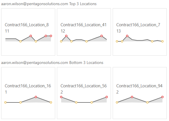
On the right-hand side of the dashboard, two charts are displayed at the top of the screen, highlighting the Top 3 and Bottom 3 locations for the selected user based on filing activity. In addition to the location names, these cards also display the number of e-mails filed by the user per location and a sparkline, showing the filing activity over time with red dots highlighting periods of high filing activity and yellow dots representing periods of low filing activity.
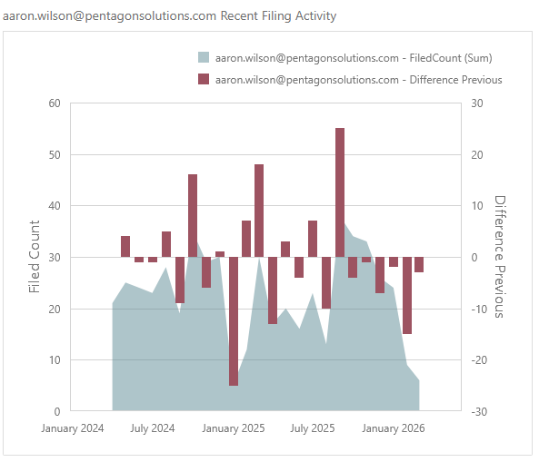
At the bottom of the page, an additional chart displays the user’s filing activity trends across all locations. The chart also includes a comparison against the previous reporting period, represented through column indicators to help visualise increases or decreases in activity over time.